If so, you’ll be in safe hands with Adamson’s. Got a question, want an idea of price or ready to book your FREE home design visit?

The colour we use in our homes can have a significant impact on our mood and outlook, whether when used as accent colours or on the walls of a room. Some colours work best in certain rooms to create a sense of harmony in the home.
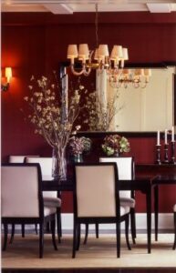
Red symbolises passion, warmth and optimism, raising energy levels and stimulating the appetite. It is best suited for dining or living rooms to create a warm sociable atmosphere. Due to its primal association with anger and danger it should be avoided in relaxing rooms such as bedrooms and bathrooms.
Sourced on Pinterest
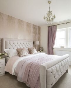
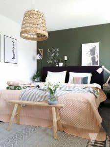
Bright pink is often considered to be overly girly or sweet but more muted dusty pink tones can create a serene relaxing space, especially when mixed with grey accents. Pink is traditionally associated with feelings of love, calmness and restfulness making it an ideal colour for a bedroom.
storyhomes.co.uk
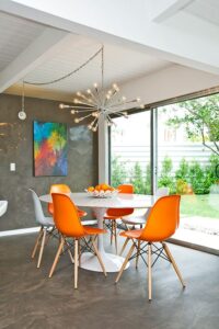
Orange induces feelings of sociability, warmth, energy and enthusiasm, making it ideal for a dining room or workout room. It can make rooms feel smaller than they are so make sure there is plenty of natural light and avoid using in bedrooms.
http://essentialhome.eu
Green conjures up visions of nature, allowing us to feel relaxed, calm, secure and stress free. It can work in any room but is especially beneficial in bedrooms where it creates a sense of restfulness and serenity.
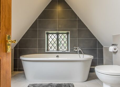
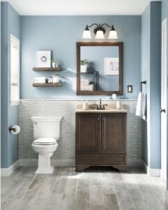
Soft warm blues help to create a soothing, tranquil space which helps lower blood pressure and also stimulates intellect and contemplation. Dark blue can invoke feelings of sadness so is best avoided as is too much blue in any shade which can make a room feel cold and unwelcoming. To counteract this, complement the blue with accents in warmer shades. Use in bedrooms, bathrooms and offices.
Sourced on Pinterest
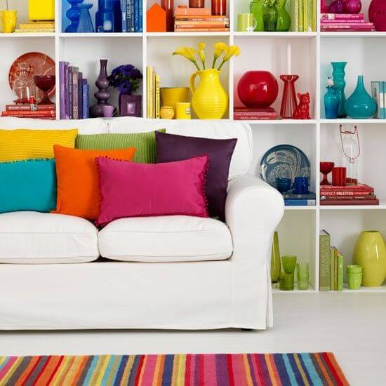
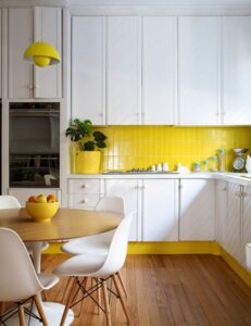
In small to moderate amounts yellow promotes happiness, energy and joy, uplifting and welcoming anyone in the room. However in large quantitites the effects can be the opposite, causing emotional distress, frustration and anger. Studies have shown that babies cry more in yellow rooms. Therefore the best rooms in which to use yellow are kitchens and dining rooms.
Sourced on Pinterest
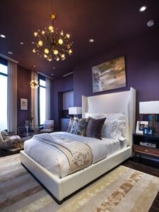
Depending on the shade of purple the connotations can be varied. Dark purple is considered sophisticated, dramatic and opulent making it perfect for luxurious bedrooms.
Light purples and lilacs create a restful, creative and almost spiritual atmosphere, ideal for relaxing bedrooms and bathrooms.
http://www.hgtv.com/design/hgtv-urban-oasis/2014
Security, stability and practicality are three words that best describe the colour brown. It works well as a base colour in a living room but should be brightened up with a livelier accent colour.
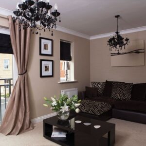
Sourced on Pinterest
Use sparingly in any room of the house as an accent colour. Black accents create a sense of drama and eccentricity as well as sleekness and modernity. Too much can invoke feelings of death and doom and can make a room feel heavy and depressing.
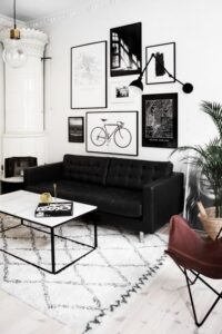
http://victoriatornegren.se